Reading--Notes
CSS
Building Blocks :
CSS treats each HTML element as if it is in its own box. This box will either be a block-level box or an inline box.
Block-level boxes start on a new line and act as the main building blocks of any layout, while inline boxes flow between surrounding text. You can control how much space each box takes up by setting the width of the boxes (and sometimes the height, too). To separate boxes, you can use borders, margins, padding, and background colors.
Containing Elements :
If one block-level element sits inside another block-level element then the outer box is known as the containing or parent element .
It is common to group a number of elements together inside a div (or other block-level) element. For example, you might group together all of the elements that form the header of a site (such as the logo and the main navigation). The div element that contains this group of elements is then referred to as the containing element.
positioning schemes :
allow you to control the layout of a page: normal flow, relative positioning, and absolute positioning. You specify the positioning scheme using the position property in CSS. You can also float elements using the float property.
-
Normal flow :Every block-level element appears on a new line, causing each item to appear lower down the page than the previous one.
-
Relative Positioning :This moves an element from the position it would be in normal flow, shifting it to the top, right, bottom, or left of where it would have been placed. This does not affect the position of surrounding elements; they stay in the position they would be in in normal flow.
-
Absolute positioning :This positions the element in relation to its containing element. It is taken out of normal flow, meaning that it does not affect the position of any surrounding elements (as they simply ignore the space it would have taken up). Absolutely positioned elements move as users scroll up and down the page.

Floating elements :
The float property allows you to take an element in normal flow and place it as far to the left or right of the containing element as possible. Anything else that sits inside the containing element will flow around the element that is floated.

Screen Sizes :
Different visitors to your site will have different sized screens that show different amounts of information, so your design needs to be able to work on a range of different sized screens.
Because screen sizes and display resolutions vary so much, web designers often try to create pages of around 960-1000 pixels wide (since most users will be able to see designs this wide on their screens).
CSS Frameworks :
CSS frameworks aim to make your life easier by providing the code for common tasks, such as creating layout grids, styling forms, creating printer-friendly versions of pages and so on. You can include the CSS framework code in your projects rather than writing the CSS from scratch.
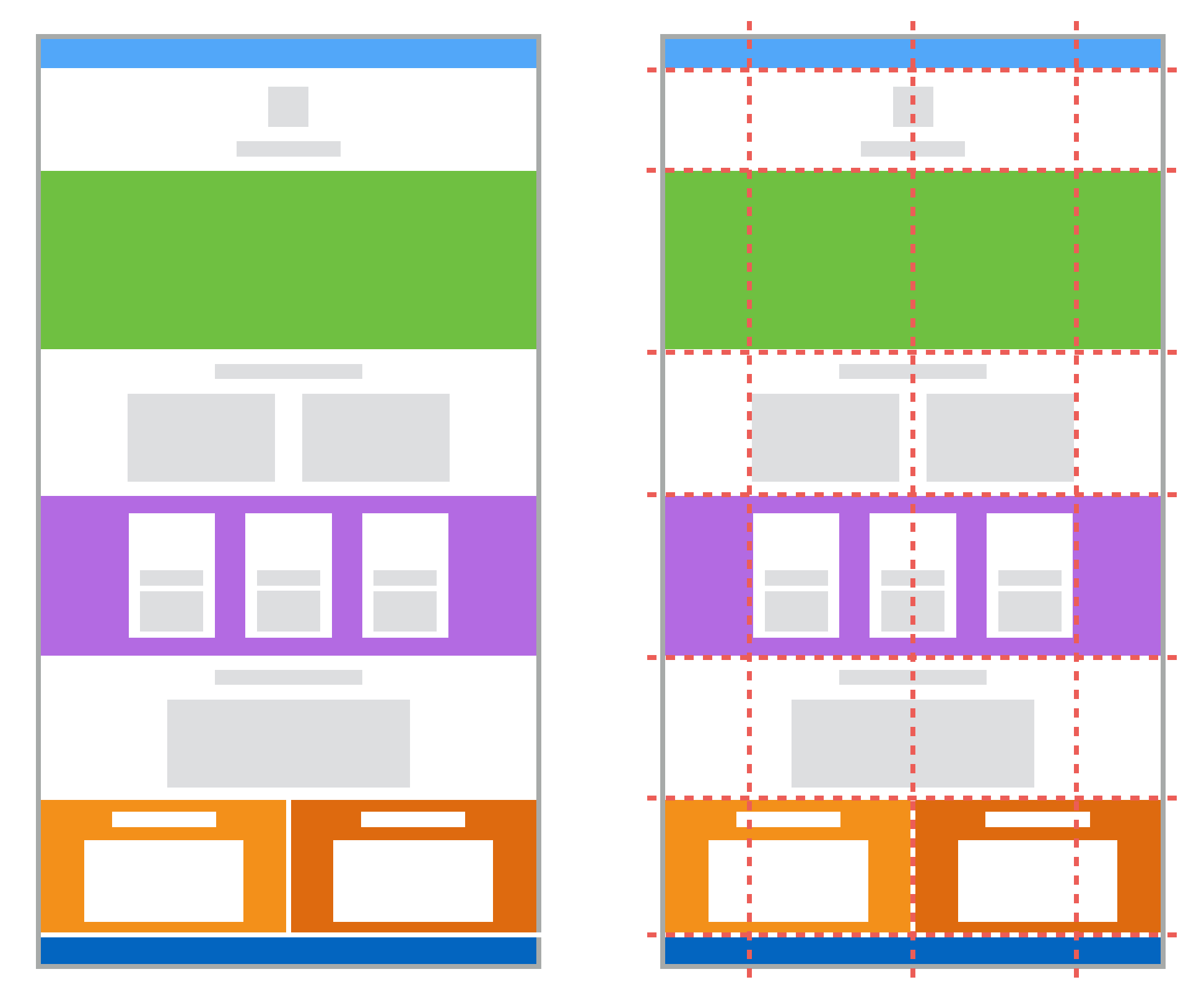
Layout Grids :
Composition in any visual art (such as design, painting, or photography) is the placement or arrangement of visual elements — how they are organized on a page. Many designers use a grid structure to help them position items on a page, and the same is true for web designers.
While a grid might seem like a restriction, in actual fact it:
-
Creates a continuity between different pages which may use different designs.
-
Helps users predict where to find information on various pages.
-
Makes it easier to add new content to the site in a consistent way.
-
Helps people collaborate on the design of a site in a consistent way.